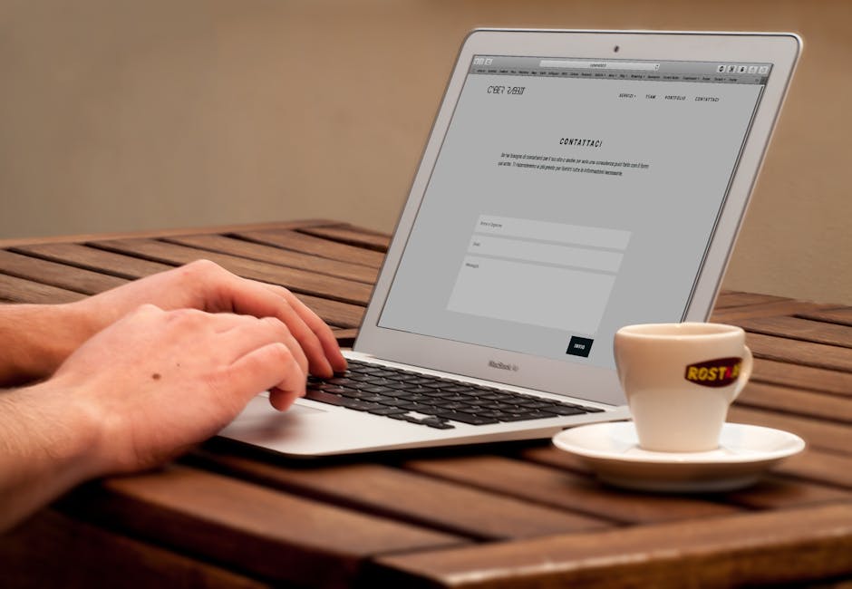
Designing the Suitable Web Forms

An efficient web form makes it easy for people to practically do everything on a website. Whether you need to sign up, buy a product, subscribe to a blog, leave a product review, web forms are important to complete your action.
Forms typically has five distinct parts:
- Input field. This is where users input their information. It can either a text box, a check box, a list of buttons, and so on.
- Field label. This label indicates the name of the input fields. So, users will know a name should be entered here and an address should go there.
- Form Structure. This refers to the order and the appearance of the fields.
- Action button. This performs the action. If a user clicks on buy, he should be able to proceed to the checkout form. If a user clicks on next, he should be able to go to the next page.
- Feedback. This verifies the action taken. Once a user finishes his purchase, there should be a message saying thank you along with the details of his order.
In designing a web form, you should first consider the structure.
-
The order of the fields.
Like in any conversation, you say your name first. Same is true with forms. On sign up, you don’t ask for date of birth first or the location, you obviously ask the name first.
-
Only ask for important details.
People on the web are in a hurry. They want to buy something, they click and viola! Make sure to ask only what is needed. An extra field of question will increase the chances of abandoning the page. This is very crucial when you are selling online because this affect your conversion rate.
-
Group related fields.
It’s not only the order that’s important. You should also need to group related questions in a logical manner. Personal details should go first, the shipping address next, the billing address, and the payment method. You don’t ask the birthday on the payment method section. The correlation between fields should make sense.
-
Stick to one column.
Forms should be one straight line because it’s easier that way. Multiple columns will confuse users and will likely answer them incorrectly. Never design a form with two or more columns.
Whether it’s the field label or the input label, texts should be always be clear.
-
Limit the number.
Field labels are NOT help labels. It should be direct to the point and limited to one to two words. This makes your form easier to scan for users. For example, when asking for someone’s name, you simply label the field: Name or Full Name. You don’t say: MY NAME IS.
-
No to Upper Case.
Sentence case offers a better advantage than indicating labels in ALL CAPS. Upper case letters are harder to read. Thus, your users will experience difficulty in scanning the form.
-
Top alignment.
Matteo Penzo’s article on labels indicates that web forms are completed quickly if fields labels are on top of the input labels. Users – specifically mobile users – can easily scan and answer the forms. If the top-aligned labels are completed faster, the left-aligned labels are have the slowest completion time.
Since action buttons trigger an action, there should be a clear distinction between different buttons.
-
Primary buttons should have the stronger color.
The submit button should be clearer than the back button. The submit button is more important than the back button. If the buttons look the same, users can easily click the other button thinking it was submit. To reduce mistakes, you should choose a lighter color for the secondary buttons like BACK, PREVIOUS, CANCEL.
-
Button location is important.
Multiple forms needs a back or previous button. If the back button is located to the next button, then, most likely users can accidentally click it. Please do not put a secondary button beside an important buttons such as PAY AND SHIP, or PROCEED TO CHECK OUT.
Always design a form from the perspective of the users. Do not make their shopping experience terrible instead make this process easier. So, in the future, they will choose to transact with you again. These are only minor changes to web forms yet they can greatly contribute to usability. It will definitely help your users without spending so much!
